World Wide What?

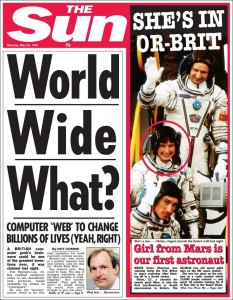
This picture has been doing the rounds on Twitter (and Facebook, no doubt).

Computer web to change billions of lives

It is supposedly from the front of The Sun newspaper – and clearly demonstrates how ignorant they are. People were only too happy to re-tweet the ignorant, bigoted journos that write for the sun.

But it seemed a bit fishy to me. Firstly, I’m always suspicious of a popular RT that seems just too good to be true. Secondly, what is that bright bit? It looks like a reflection or a light or a camera flash…but newspaper is hardly reflective, and 20 year old news paper is not that white. Finally, this is a photograph taken of something vertical – on a screen or a wall. It isn’t a photo of a newspaper that someone “stumbled” on, put on a table/floor and took a picture of.

I mentioned this on Twitter, and CJ (he has a locked account) sent me a link to the full page. A full page digital layout? From 1992? That is a little suspicious.

World Wide What?

A thorough Googling revealed no other digital versions of The Sun from that era – and very few from later years. But what I did notice was that the Mast Head (the red bit at the top) from the early 90s didn’t match this one.

The Sun Mast Heads

Also, the date (again, thanks to CJ for noticing) was May 1991, but the first website wasn’t published until August 1991. Although plans for the early web had been in progress earlier, would this really warrant half of the front page of a gaudy red top? The space on the front of The Sun should feature a scantily clad starlet or a disgraced politician. Ideally both together.

Finally, a bit more Googling showed that I was very late to the debunking party and that it had already been discredited on Reddit.

Interestingly, Reddit told me where the original had come from, and it was somewhere that I had found very early on in my search…but I had discounted it because it came from The Sun, and I wasn’t prepared to trust their ignorant, bigoted journos. 

The original article came from The Sun – it was a spoof article written for Hold Ye Front Page (warning, this is a link to The Sun, and I know many of you refuse to visit their site).

So, two lessons to learn here. If something looks too good to be true, it is probably worth checking before retweeting. Secondly, just because the source of a piece of information is sometimes bigoted and unreliable doesn’t mean it should be automatically discarded.

Posted in Uncategorized | 3 Comments

A #wander Up a Church Tower

Disclaimer: Most of these pictures aren’t great as they were either taken in dimly lit rooms or stairways, or in incredibly bright sunlight, which meant that I couldn’t see where the camera had focused, or how it had light-balanced.

Anyway, I noticed recently that as part of the Heritage Open Days the church tower of St Mary’s in Nottingham’s Lace Market was open for two days. It seemed like a great outing for me and The Boy, and the views from the top would be amazing.

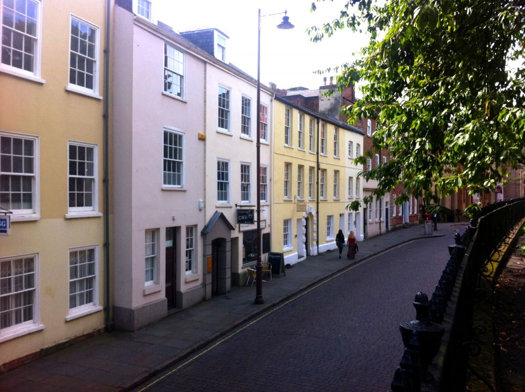
St Mary’s is on High Pavement in the Lace Market, a pleasant mix of modest Georgian and massive Victorian buildings. My favourite part of Nottingham.

High Pavement, Nottingham

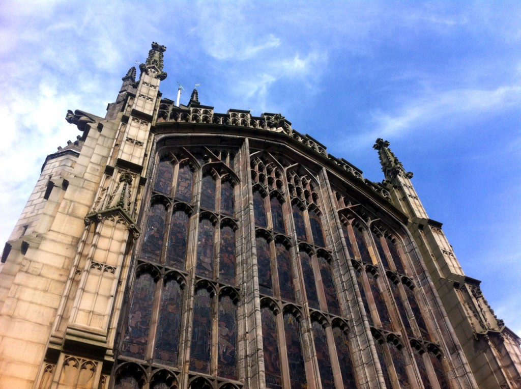
In the middle of this densely-packed area stands St Marys. It is mentioned in the Doomsday book and is thought to be at least the third building on this site. The main body of the church dates from between 1377 and 1509. The nave was finished before 1475. It is, apparently, an excellent example of the Perpendicular style of architecture.

It is also, because of the narrow streets around there, a devil of a job to get a good photo of it.

St Mary's, Nottingham

After meeting with the lovely volunteers from The Friends Of St Mary’s Nottingham who were hosting the Heritage Open Day, I handed over £4 and The Boy and I set off up a very tight stone staircase.

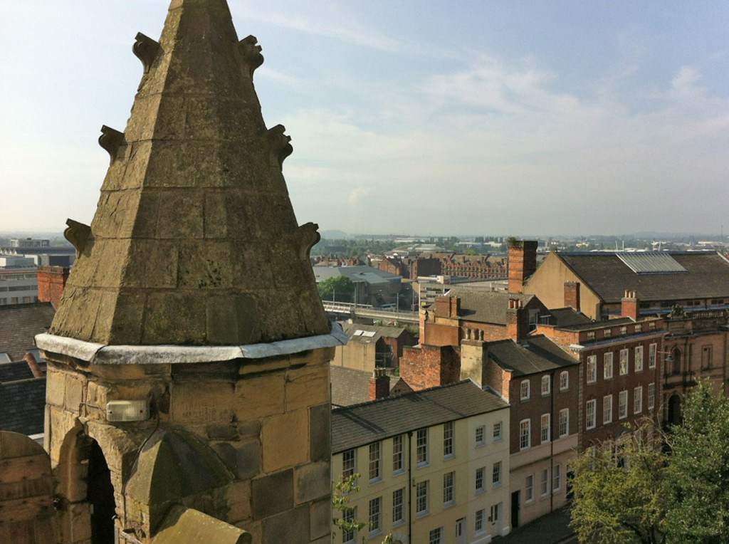
This lead to a walkway with a great view of High Pavement…

High Pavement from St Mary's

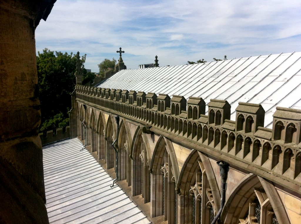
…and the roof of the nave.

The nave, St Mary's, Nottingham

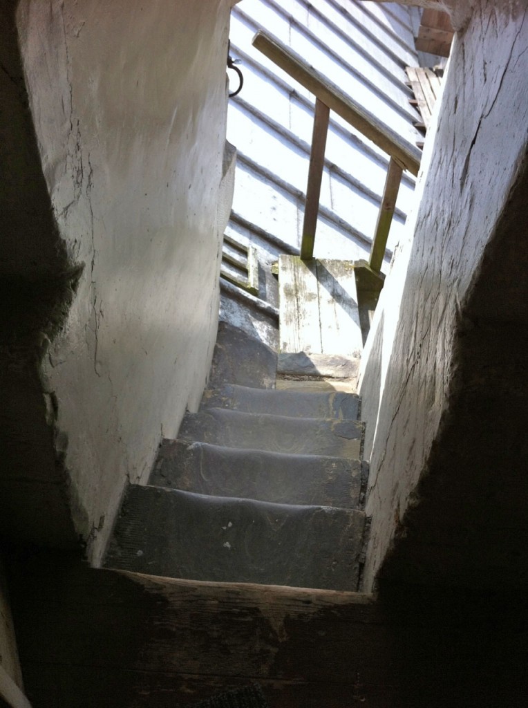
On, up a narrow flight of steps (viewed from above)…

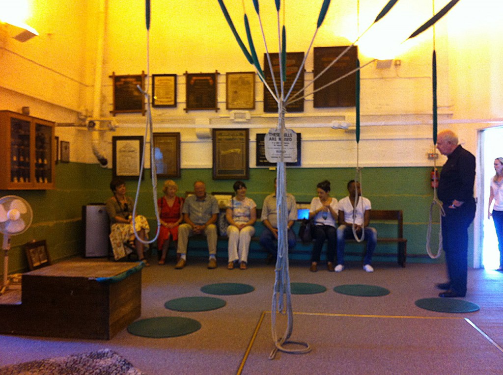
And in to the dimly-lit bell ringing room. Here we had a brief talk about the history of bell ringing at St Mary’s. I’d no idea that a peal of bells was such an involved performance – 5,000 changes, and over 3 hours in duration. The plaques in the background celebrate previous peals and some date back to the 18th century.

The talk finished with the ringing of a bell – it was very loud and sounded exactly like a spooky church bell in a horror film. It was too loud for The Boy – who was rather upset.

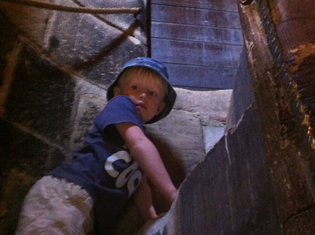
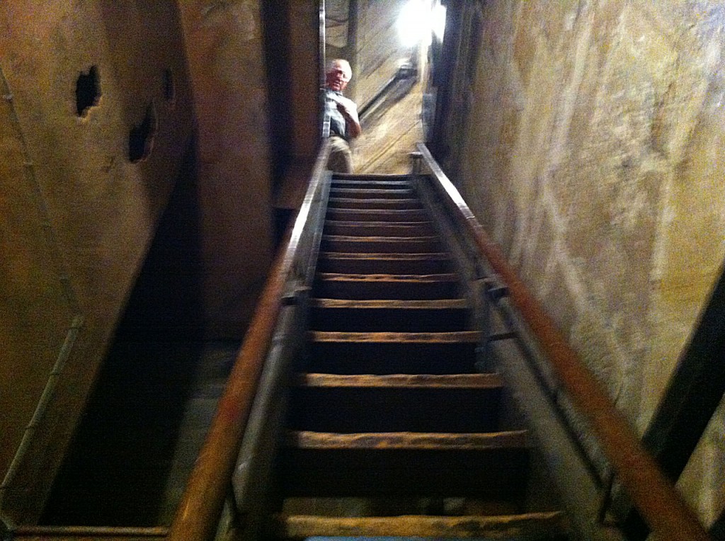
Then up this ladder. It is a lot steeper than it looks in the photo, and was pretty much the final straw for The Boy. We left at this point and went and did something more fun in the sunshine.

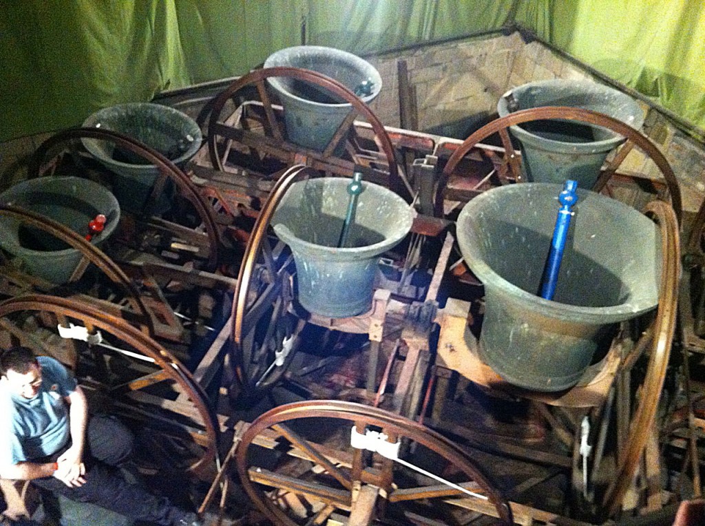
Two hours later, I came back on my own and finally managed to get to the bell room (or whatever it is called). It was poorly lit, with a bright central light that ruined all the photos I took.

There are 12 bells dating from the 1930s all the way back to the 15th century. There is also a small 12th century bell, which they don’t ring as it “sounds awful”.

I was told that the method ringing the bells “mouth up to mouth up” is a particularly British method, which doesn’t happen elsewhere. Every day is a schoolday. They then rang one of the bells for us… but only if we all put our fingers in our ears. Old-school Health & Safety.

The bells at St Mary's, Nottingham

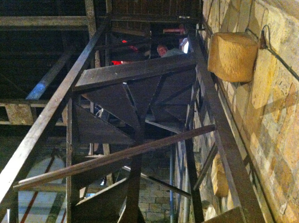
And then we went on, up a wooden spiral staircase…

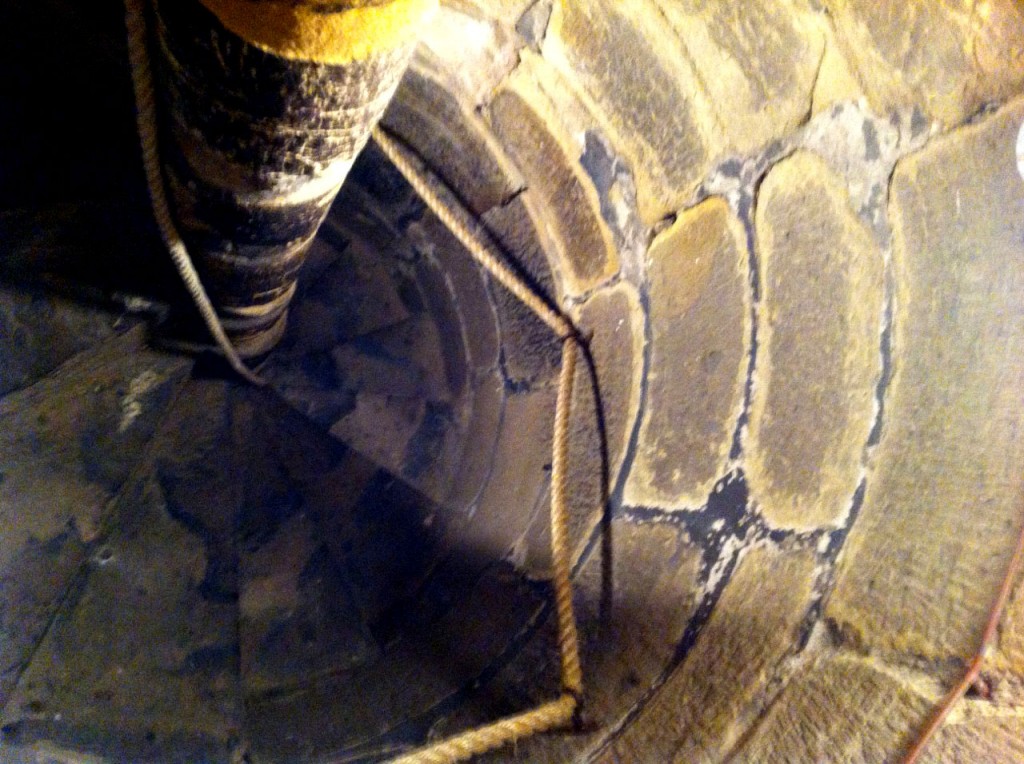
…and then on to a stone spiral staircase. It was incredibly narrow (viewed from above).

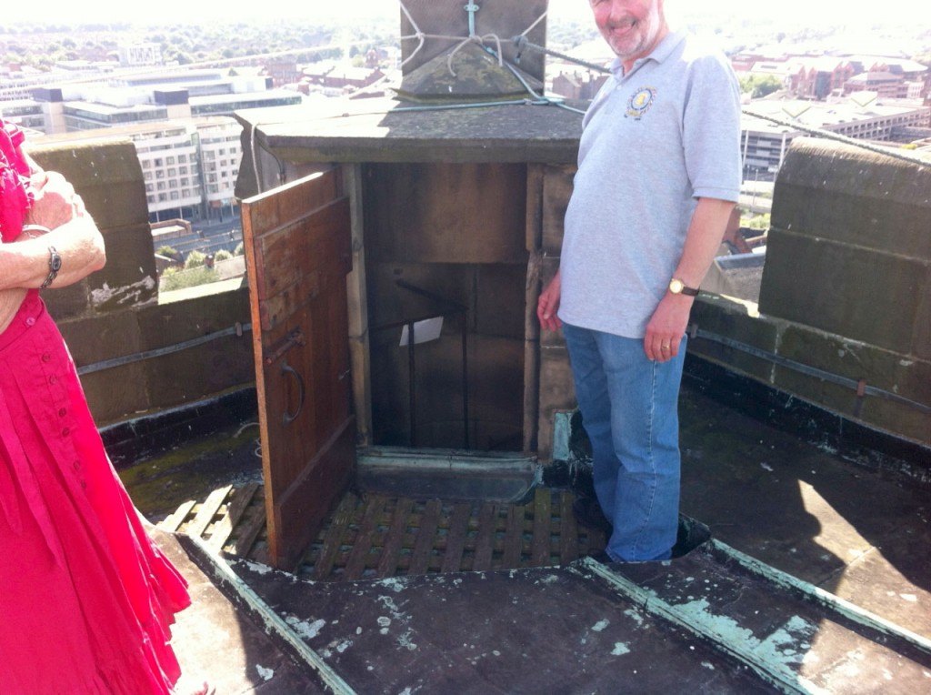
And then, with a “Mind your head, duck” each, we were on the roof.

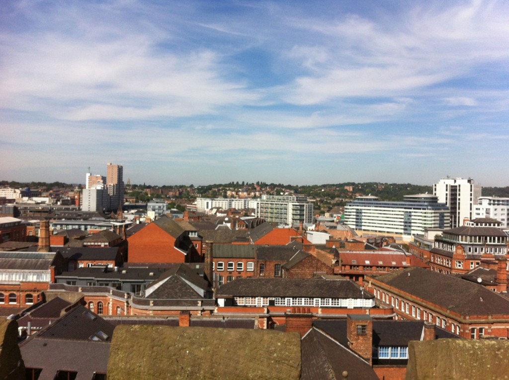
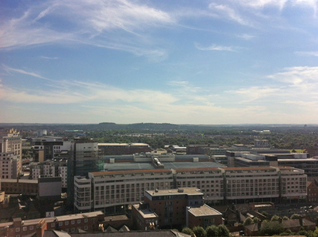
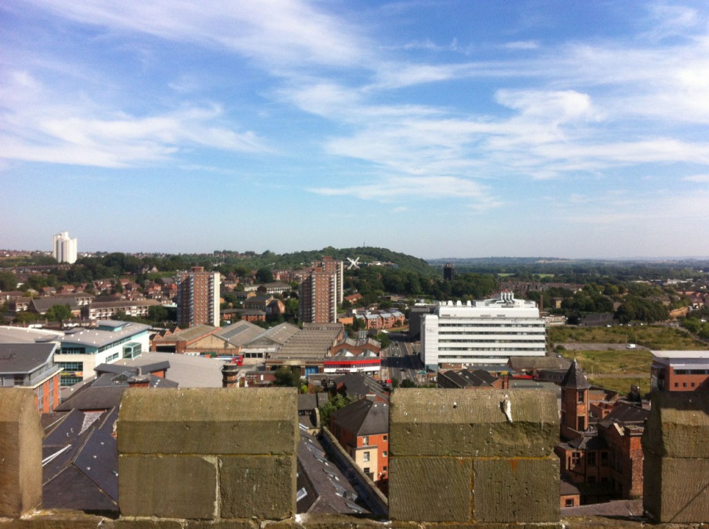
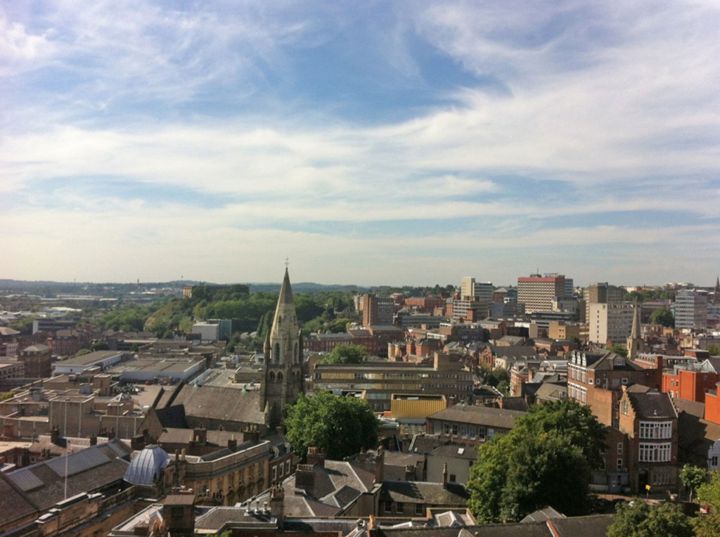
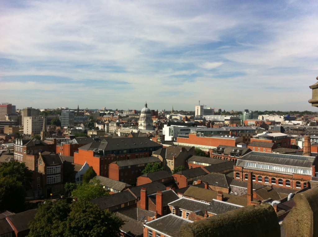
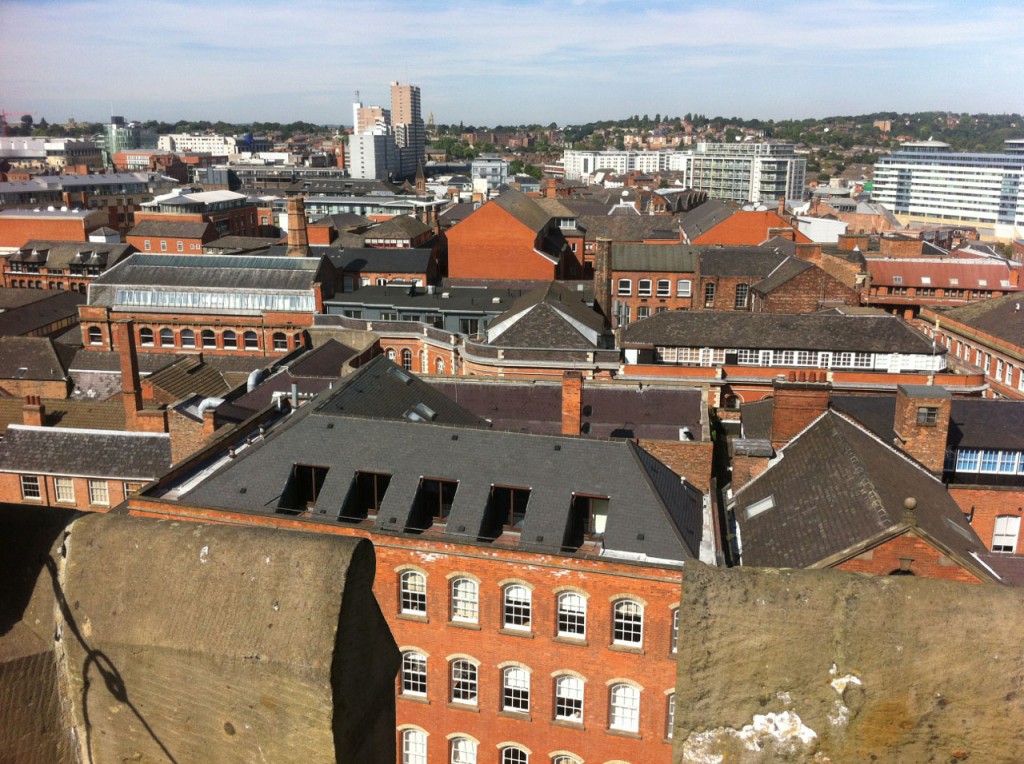
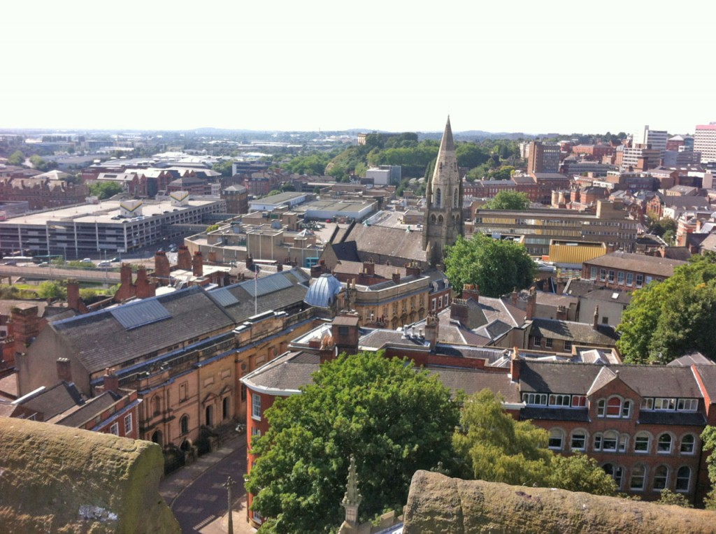
And here’s Nottingham. North:

South:

East:

West:

The Council House and Market Square:

The Lace Market:

Broadmarsh and the castle:

It seems a shame to finish on a shot of Broadmarsh and all its bulldozed heritage, so here’s a rather splendid shot of St Mary’s from the ground.

And a big thank you to all the brilliant volunteers from The Friends Of St Mary’s Nottingham for all the interesting information – and being incredibly patient with a man with a rather upset little boy.

Posted in Wanders | 4 Comments

Detail from a folder cover

Because those posts with lots of photos of old magazines are very tall, and this blog really ought to be showing off my design work (how else is a freelance graphic and web designer going to advertise himself?) here’s a snippet from the cover of a folder I did ages ago…

Jelly Baby cover design

Posted in Design work | 3 Comments

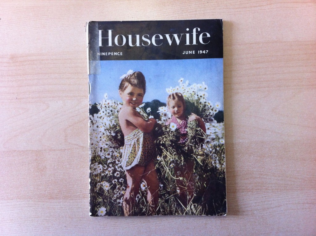
Housewife magazine, 1947

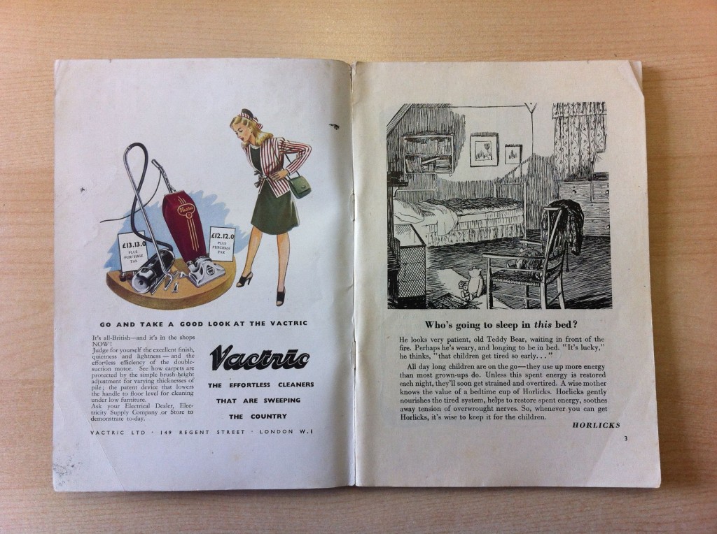
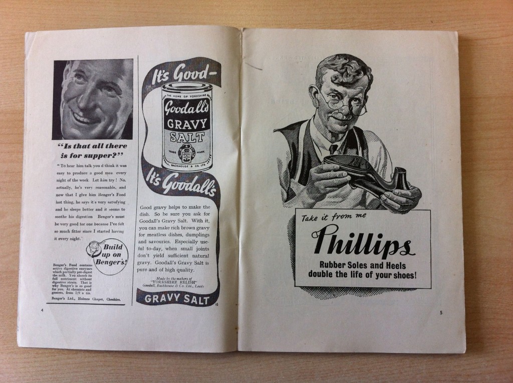
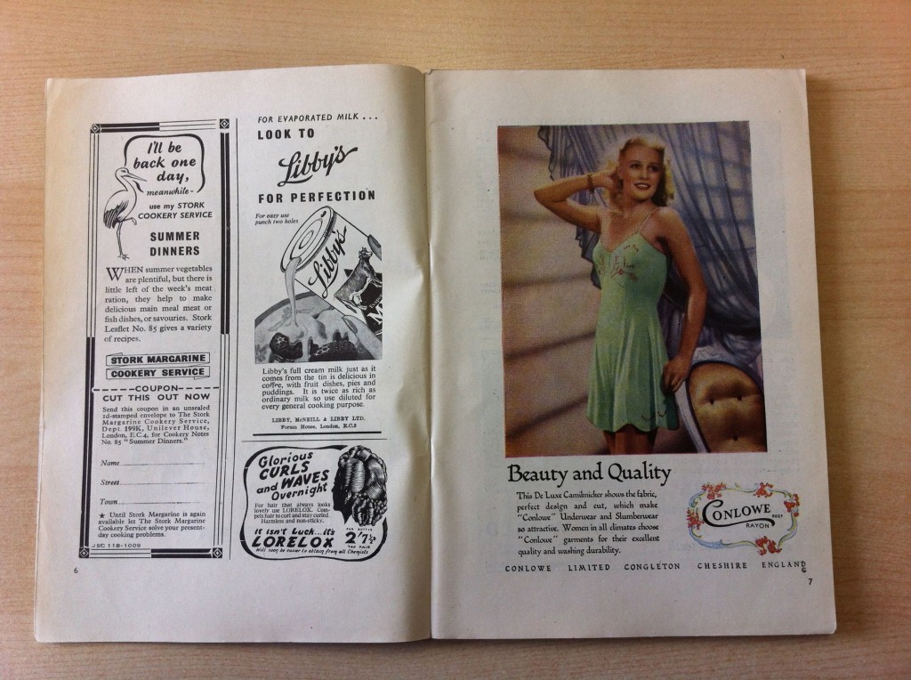
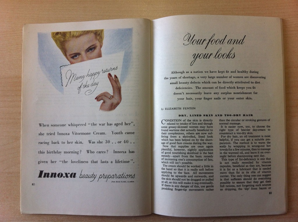
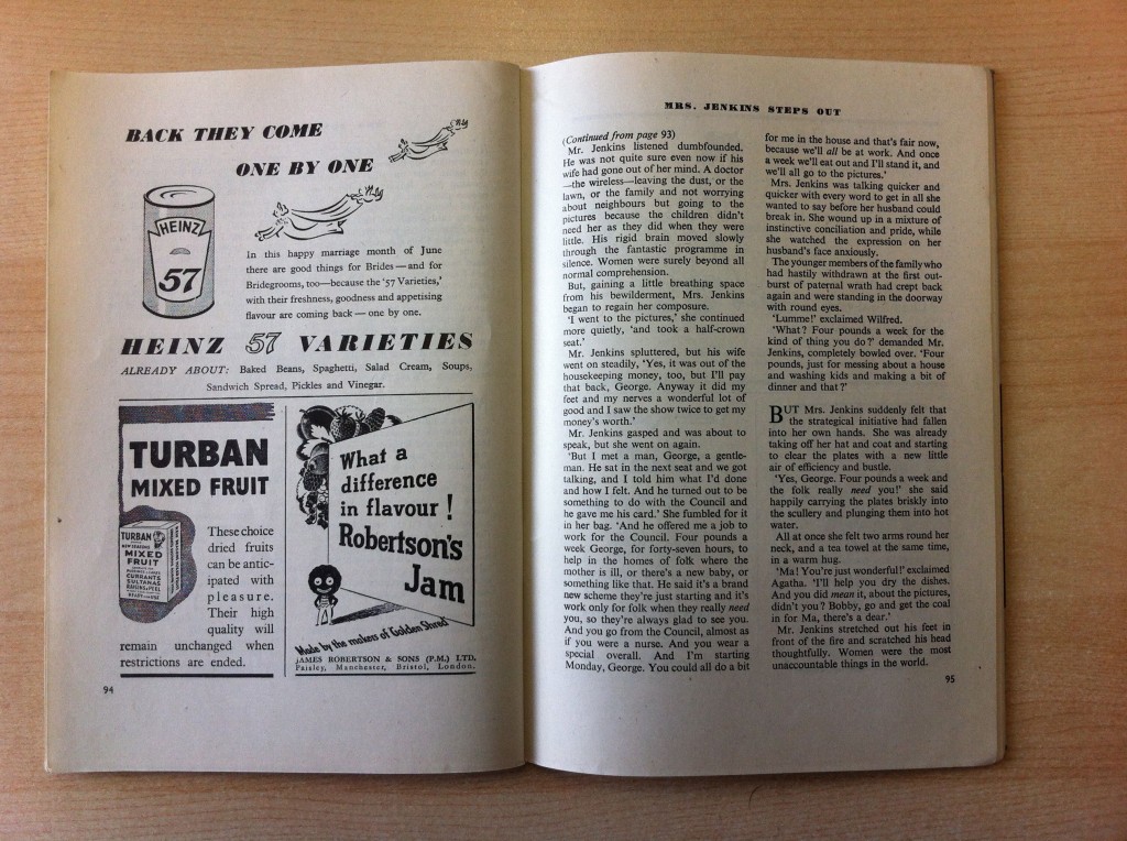
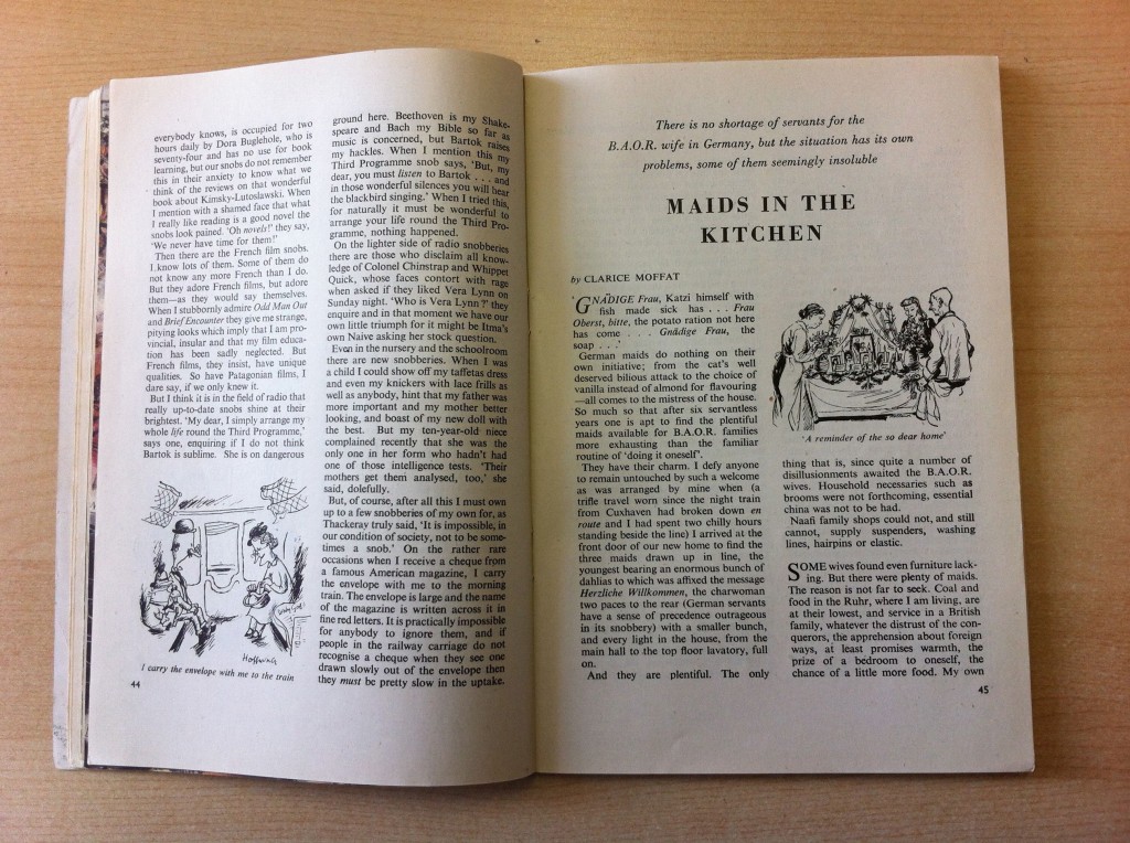
A few spreads from a 1947 edition of Housewife magazine. It is everything you would expect – patronising, shallow and chauvinistic, but it has a real old fashioned charm.

One thing that stands out on reading it is the effect the war still has on the country in 1947. From the advert that suggests “the war has aged her”, to an article written from the perspective of a wife of a British Army Of the Rhine officer and even the mention that the fuel emergency delayed publication – it is clear that it’ll be a long time before the war will become the distant memory that it is today.

Housewife Magazine, 1946

The effortless cleaners that are sweeping the country…

Housewife Magazine, 1946

Is that all there is for supper?

Housewife Magazine, 1946

When summer vegetables are plentiful, but there’s little left of the week’s meat ration…

Housewife Magazine, 1946

When someone whispered “the war has aged her”…

Housewife Magazine, 1946

Turban Mixed Fruit…

Housewife Magazine, 1946

There is no shortage of servants for the B.A.O.R wife in Germany…

Housewife Magazine, 1946

Housewife Magazine, 1946


Posted in Uncategorized | 6 Comments

Promotional material for a theatre

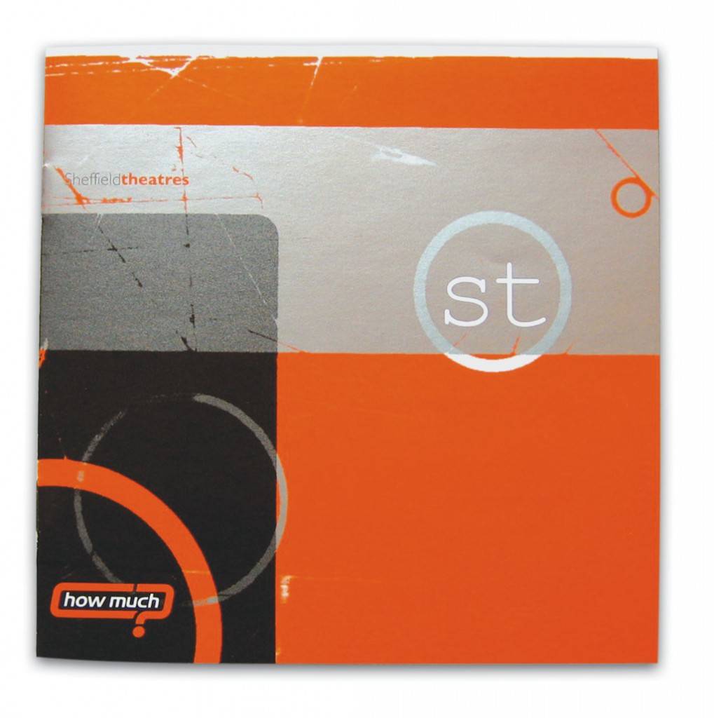
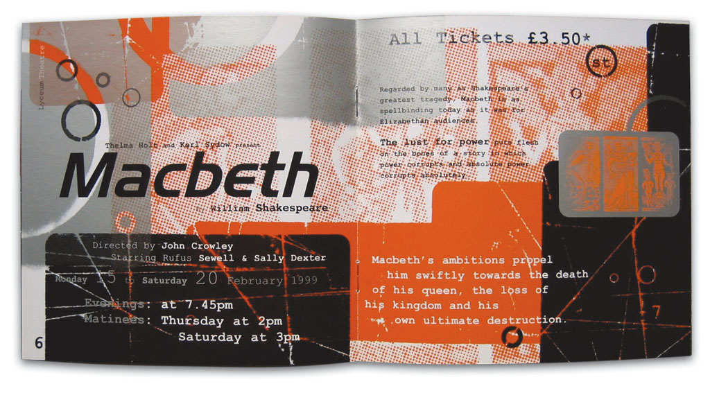
A recent conversation on Twitter about improving theatre attendance reminded me about this brochure I did a long time ago. It is probably my favourite piece of work, so I’m slightly surprised I haven’t blogged it before.

It was a lot of fun to do, and the process included printing shapes and patterns on to thick sheets of tracing paper, scrumpling them up and running them through the fax machine. Then the resulting faxes where scanned in to Photoshop and used as either the black, orange or silver areas. To make it extra interesting (difficult), Photoshop back then couldn’t display these “spot” colours, so I had to work in black, yellow and cyan. It was only when it came back from the printers that I was able to see if it had worked.

Sheffield Theatres - How Much? campaignSheffield Theatres - How Much? campaign

Posted in Design work | 3 Comments