This was supposed to be one blog post, but it became too long for this type of site. If anyone expresses any interest in the other two parts I’ll finish it. Let me know in the comments.
This post is primarily a response to the bone-headed post (read it, then come back) by John Naughton (professor of the public understanding of technology at the Open University) in The Guardian. It is also prompted by a number of discussions I’ve had on Twitter where people thought that the new ‘design’ of a site was what had made it worse.
It seems that although people (some of them are even so-called technology professors – see above) use websites every day, they have very little idea how they are made.
I’m not talking about about HTML/CSS etc, or even the graphic design. I’m talking about the whole process. A website is more than just code and design.
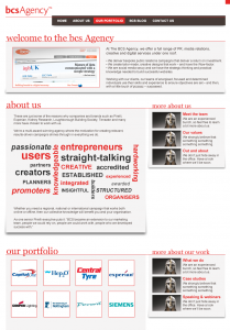
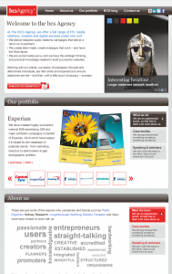
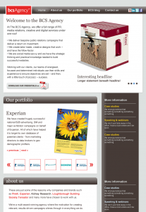
I will be illustrating this post with visuals for a website. They are all for the same website (many are rough, rubbish and unfinished) but they might show how the design process progresses.
 A clean slate?
Before a designer even puts pencil to paper (and many still do) there are certain conventions that must be obeyed. Firstly, websites are assumed to have a ‘structure’ – beginning with a recognisable home page which includes a menu with items such as “about us” “our products” and “contact us”. These will vary by website, but there is always a home page with a menu.
Secondly the site must conform to the corporate identity of the organisation it is for. For example, the font used in headings will be the same as that used in printed material, and there may be a pre-set colour palette. There may also be ‘graphic devices’ – swooshes, or other elements that are mandatory. Many organisations will have guidelines how photography should be used (some insist on only colour images, other mono) and even the tone of voice used for any writing.
Thirdly, the site must suit the organisation it represents. A site for a restaurant will look very different from one for an engineering company. Websites for academic or Pharma organisations are different again. You can’t muck about with this. Well, you could, but visitors to the site simply won’t understand it, and the client won’t approve it. Which brings me to the client…
Finally, the site must suit the client. This is partly defined by the requirements outlined above, but must also take into consideration their personal preference and personality. Some clients hate/love particular colours, others have inter-office politics to deal with, others may loathe the corporate identity they have to work with, and will want to tone it down as much as possible. Some clients have initiated the new website project… and others will have had it thrust upon them from on high.
So, before the design has even begun, a designer must take into consideration internet conventions, client corporate identity, client sector and finally the client him/herself. A website never starts with a clean sheet of paper.
 The brief
Normally, and taking into consideration the things above, a designer will be given a brief on what is needed from the design of the site. This will usually have come directly from the client and may be as loose as “Design us a cool new site” or be a detailed description of what exactly should go it it. It will also be filtered through the experience/ability of the Project Manager. Some are good, they know the client well, and know what they want. Some are overworked and are constantly on the back foot and basically trying to keep their head above water and keep everyone one happy.
This would all be fine, but we have forgotten The Pitch.
 The Pitch
This was the four-hour, coffee-scented, adrenaline-drenched meeting during which ‘we’ won the client from ‘them’ (the incumbent agency, who was probably doing a fair job, but the client had got bored of them, and thought that changing agencies would remedy their lack of consumer engagement and high bounce rate. (Look them up)).
During this meeting, people who often have very little to do with the actual implementation of a website will promise the earth in order to get the account. They will throw out terms such as “social media engagement” or “VLOGS” and will attempt to convince the client, who we have established may not even want to update their website, that they must update it. And they must use all the bells and whistles available with today’s technology. And many that aren’t.
So, against a background of pre-conceived internet conventions, personal preferences and pie-in-the-sky promises, the design of the website can finally begin….
As I said above, to keep this post short I have finished it early. If you would like to know more, let me know in the comments. If not, also let me know, as I’m in two minds as to whether to leave this post up. Thanks for reading this far.

From my blog: Graphic designers are NOT ruining the web
http://t.co/JMLL7Ss6
Write the other two already… I am seething with rage… that guardian article also reminded of a folk tale about a couple of boys learning the skill to revive dead bodies who end up reviving a dead lion who kills them all and eats them up all because they weren’t patient enough to learn the skill to kill revived dead bodies…